
Summary
- On macOS, Launchpad serves as the primary app launching interface.
- From a user interface perspective, Launchpad is antiquated and clunky to navigate around.
- Apple has since created a top-notch app launcher for iOS and iPadOS known as the App Library, which it should really consider adopting on macOS.
For the most part, macOS is a well-oiled machine on the user interface front. Apple has spent decades tweaking and adjusting the UI, and the result is a polished and thought-out approach to graphical user interface (GUI) design. While I’m fond of the current state of the Menu Bar, the dock, and the desktop, I do have one longstanding gripe: the OS’s outdated Launchpad.
Launchpad first debuted on the Mac with 2011’s release of OS X Lion. At Apple’s WWDC keynote that same year, company executive Phil Schiller took to the stage to introduce the feature, announcing the following: “With Launchpad, you simply make a simple gesture — a pinch motion — and all your applications fly onto your screen. No matter where they are on your system, Launchpad knows where they are.”
Related
Windows users might hate this, but macOS just does it better in 5 ways
I’ve worked with both operating systems, and Apple’s just does it better.
In practice, Launchpad was a major step up in usability for its time. When compared to having to navigate through the OS’s file manager to access your installed programs, this new dedicated interface was both a time saver and a visual treat. It took the app-grid-on-a-home-screen paradigm that proved successful on the iPhone, and translated it directly onto the Mac.
The problem, however, is that Apple has neglected to evolve the Launchpad to keep up with the times. By today’s standards, the feature is downright clumsy to interface with. Its horizontal pagination feels tedious to scroll through, apps can’t be organized alphabetically, and icons are plagued by the pre- iOS 18 sin of auto-aligning to the top left-hand corner of the display. Anecdotally, I find dragging and dropping of icons into folders to also lack the fluidity found in Apple’s mobile OS counterparts.

Related
This handy macOS 15.2 feature puts Apple Intelligence to shame
Apple continues to hype up the utility of Apple Intelligence in macOS, but this small, innocuous, non-AI addition is far more useful.
macOS ought to poach the iPad’s App Library
With iOS and iPadOS, Apple has already built a superior app launcher experience
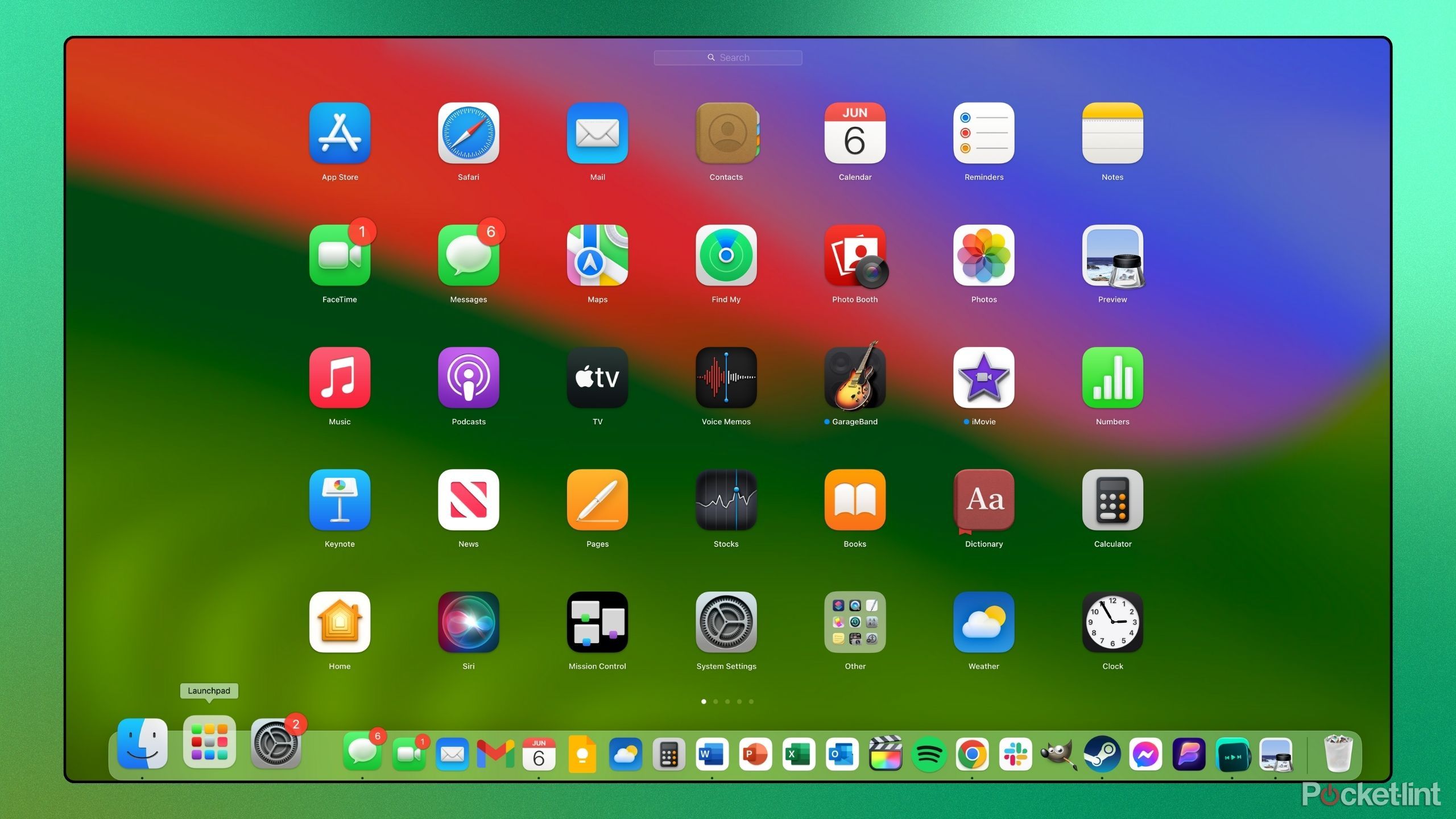
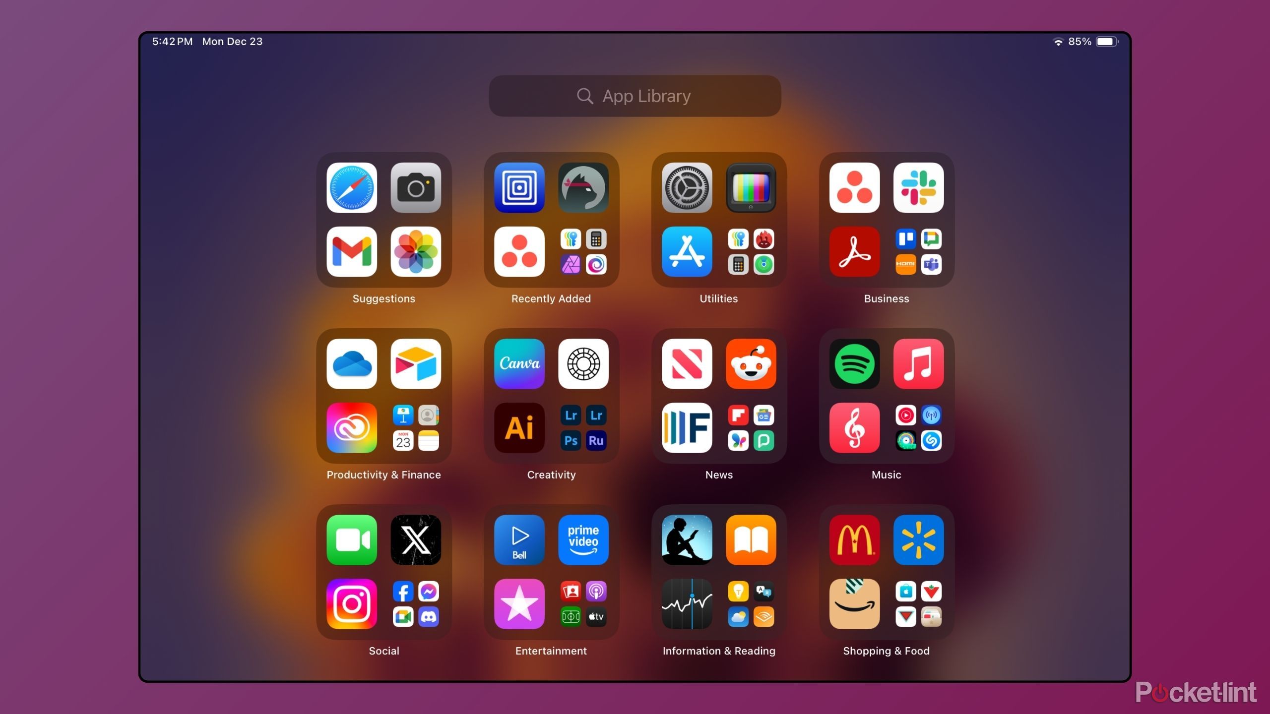
The tragedy of Launchpad’s neglected state is compounded by the fact that Apple has already designed a better solution in the form of the App Library. Found on both iOS and iPadOS, the App Library is an app launching interface built for the modern day.
With the App Library, your software is auto-sorted into folders based on type: these categories include productivity, social, utilities, business, and more. An alphabetical scrolling list of all installed apps is also easily accessible from here, which supplements the search bar found at the top of the screen.
Related
iPhone Mirroring in macOS Sequoia is a clever illustration of Apple’s strengths — and limits
Being able to access your iPhone remotely from your Mac is handy, but also a clear example of how dependent Apple is on the iPhone.
Of course, the App Library isn’t everyone’s cup of tea; many are critical of the inability to manually sort apps into categories, and others prefer the app launching experience provided by Android‘s tried-and-true app drawer interface. Nevertheless, I firmly believe that Apple’s App Library is a major step up from the existing Launchpad on macOS, and I feel it’s high time the company brought the experience to the Mac.
To be clear, I’m not suggesting Apple remove Launchpad in its entirety.
To be clear, I’m not suggesting Apple remove Launchpad in its entirety. I’m still grumpy over the removal of the OS’s widget pane known as Dashboard, and I’d hate for Launchpad to succumb to a similar fate. Rather, I hope the company introduces the App Library as a supplemental interface for those of us who are a fan of its unique approach to app categorization.
Modern Macs are powerhouses, and macOS deserves a rekindled investment in its UI.
At the moment, it appears that Apple’s bandwidth is largely at the mercy of AI-related features and tools. I have my fingers crossed that post- Apple Intelligence deployment, the company turns its software focus back over to interface-related advancements. Modern Macs are powerhouses, and macOS absolutely deserves a rekindled investment in its UI. Oh, and while we’re at it, why not reinstate the far superior pre- macOS Big Sur Launchpad icon, Apple?
Related
5 reasons my loyalty lies with Windows — sorry, Apple fans
Side-by-side, Windows is taking home the gold.
Trending Products


