Key Takeaways
- Apple and Google should enable larger, more complicated widgets on phone lockscreens.
- It would let us see more useful info at a glance, particularly on devices with always-on displays.
- There are design considerations, but it should ultimately be up to us what our lockscreens look like.
It might seem trivial to some of you, but one of the things I was excited about most when upgrading from an iPhone 13 to an iPhone 16 Pro was finally getting an always-on display (AOD). I keep my iPhone propped up at work to see alerts and also propped up on my nightstand when I sleep if I need to check the time in the middle of the night. When I travel, my phone is a do-it-all device, even taking the place of the smart speakers and displays I have at home.
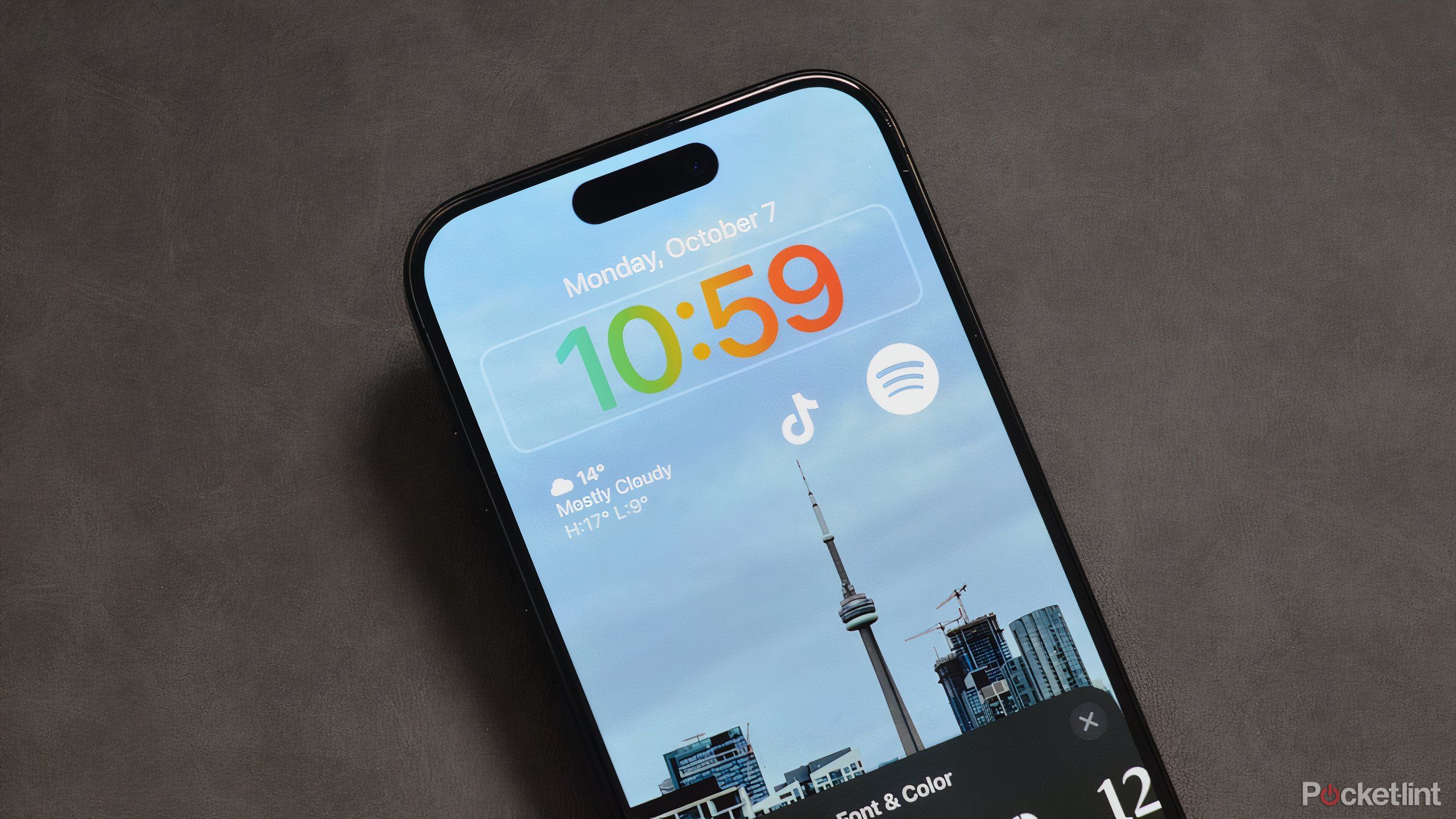
One of the disappointments of AOD tech on both iPhones and Android devices is that lockscreen widgets aren’t living up to their full potential. Widgets are tiny, or else something like a clock dominates the screen for no good reason. I say it’s time for Apple and Google to get their act together and let us customize our phones to the hilt.
Related
The 7 must-have tech tools for travel I always keep in my bag
If your philosophy is to travel light, these are the seven tech tools that should always be in your bag.
The status quo is mediocre, unfortunately
Et tu, Android?
While iOS 18 has improved customization options, widgets are still limited to a small tray under the clock. You can’t resize that time display, and no widget can take up more than half of the tray. The Weather widget, for example, can be expanded slightly to show you current conditions alongside highs and lows, but there’s no way to see a seven-day forecast without unlocking.
There’s little point in a Spotify widget without a “now playing” view, or something else that lets you jump straight into a playlist or podcast.
Many iOS widgets are little more than an icon, showing you basic info if any. Some only serve as an app shortcut, two of the worst offenders being Spotify and Reddit. Those services are probably restricted by the way iOS is built, but there’s not much point to any Spotify widget without a “now playing” view, or something that lets you jump straight into a playlist or podcast.
An obvious choice for Reddit would be the ability to jump straight to recent thread and message replies.
Related
Best smart alarm clocks: Restful sleep and peaceful mornings
Get to bed on time and wake up feeling fresh with realistic day-to-night cycles, environmental feedback, and other features.
Often, apps that should have widgets don’t have any, like Apple’s Notes. It’s honestly baffling that I can’t pin something like a shopping list to my screen, which would let me scan it as conveniently as a Post-It.
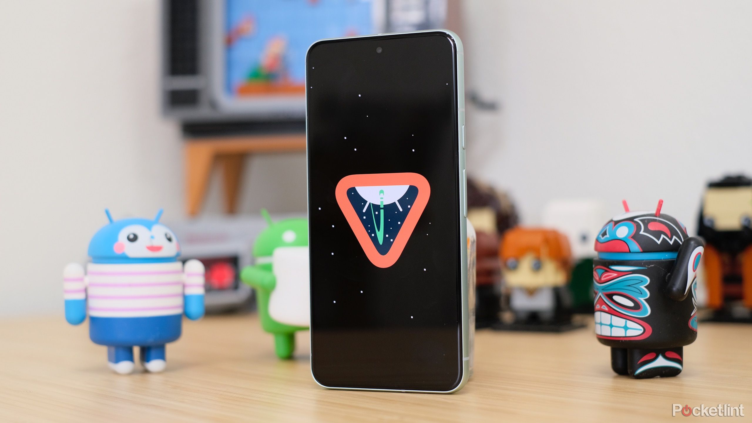
The Android situation is worse, believe it or not. Android 15 doesn’t seem to support any lockscreen widgets on phones, so you’re stuck looking at an admittedly pretty clock. It’s backwards from the usual trend with Android — Google has long been ahead of Apple in customization options.
The obvious advantages (and disadvantages)
What’s the point of a big screen?
I suspect a lot of people are like me and need up-to-the-second info from their phone, whether that’s breaking headlines or an update on that grocery delivery from Instacart. iOS and Android both have live activity notifications of some kind, which do fill a gap, but we don’t always want an app developer deciding when that info should pop up.
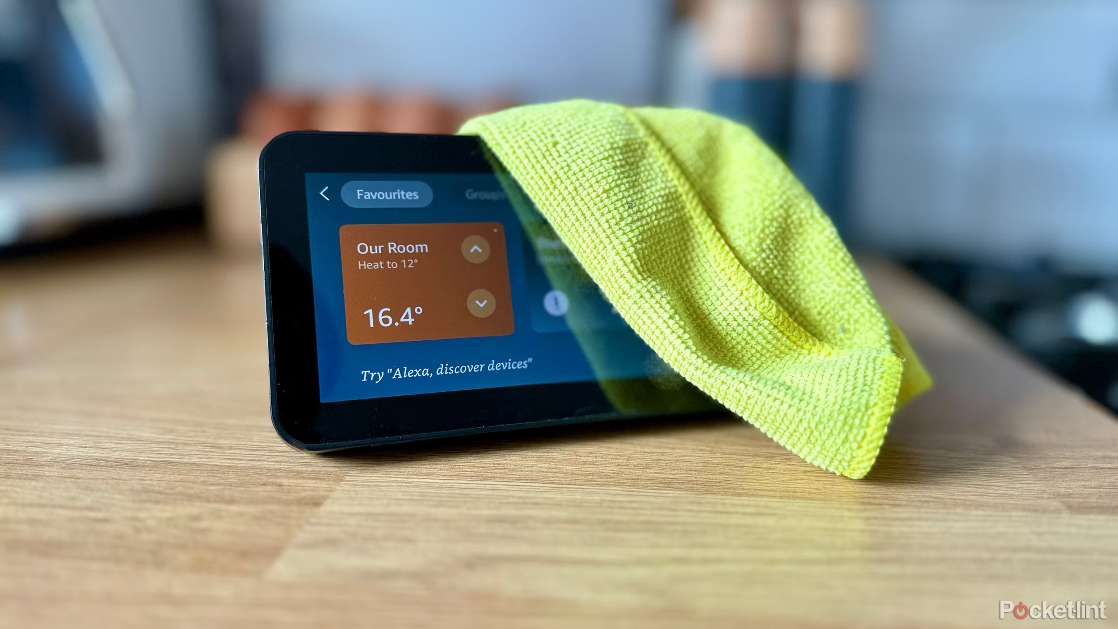
There’s no technical reason a phone with AOD can’t behave like a compact Nest Hub or Echo Show and show me extended info about the weather, my calendar, smart home control, or anything else I can think of. Most smartphones are now near or over six inches, sometimes closer to seven. That’s about as large as the second-gen Nest Hub, and two inches bigger than the Echo Show 5.
There’s no technical reason a phone with AOD can’t behave like a compact Nest Hub.
The real barrier seems to be design goals. Apple and Google want to preserve space for notifications, and that makes sense — I wouldn’t want a calendar widget to block me from seeing texts from friends or family. But, iOS already offers the option to group notifications at the bottom of the screen, so there should still be plenty of room for bigger widgets if users so choose.
Related
When is Android 15 coming to non-Pixel phones?
Google’s latest software update has already come to Pixel phones, but you’ll have to wait longer if you use a device from Samsung, OnePlus, and more.
The companies are probably also worried about esthetics. It would be relatively easy for users to mess up their lockscreens, much in the way some iOS 18 users are uglifying their homescreens with newfound color and icon control. But that should be up to us — real freedom means being able to make a mistake. Just give us the tools to revert things if necessary.
Don’t hold your breath
Since Android 15 and iOS 18 only recently made it out the door, there’s no clue whether we’ll see better lockscreen widgets in Android 16 and iOS 19. Those operating systems are unannounced and extremely early in development, so they’re definitely months away from developer betas, never mind finished versions for the public.
Any smartphone we own should feel like ours, conforming to our lifestyles.
I could see Android 16 delivering what I want, since Android 15 already has large lockscreen widgets for tablets, but that’s hardly guaranteed. As for iOS, Apple is notoriously conservative about cosmetics, so I’m not getting my hopes up. It took years for the software to get any widgets at all. The company is concerned with ensuring that iPhones always look like iPhones and conform to a specific vision of slickness.
Related
New Apple Intelligence tools go online with iOS 18.2’s beta release
Apple’s first beta for iOS 18.2 has been released, and with it, several brand-new Apple Intelligence features.
As I said a minute ago, however, real freedom means room for mistakes, and freedom is what any smartphone owner should have. It’s a device we’ve spent hundreds of dollars on, or even well over $1,000. It should feel like ours, conforming to our lifestyles rather than behaving like something on loan. Let me squeeze the clock into a tiny corner of my screen — I’ll be the judge of whether it’s too small to squint at when it’s three in the morning.
Trending Products

